Thursday, December 16, 2010

Number 2.

In this picture the lettering and a border of the hats color is enhanced and so is the blue on his shirt. This was simply shot with the strobe light, with a white back drop. It fits into the theme because its black and white portrait with a pinch of color.

2nd theme.

This is the first picture for my second theme. The second theme will consist of black and white portraits with a tad bid of color and by doing so I just dublicate the layer and erase something out to show the real color. In this picture, I erased his tie so that the colors would show. I chose the tie because the colors stood out the most.

Friday, December 10, 2010

Number 8.

The composition on this photo has a dark look to it. The emotional impact has a chill type feeling. This image again contributes to my theme because of the background. I like how my pictures are coming out because they all are like my style. A cool type look. My idea did not change at all. It was kind of difficult figuring out the positioning of the angle lighting. From here I will continue on looking for spaces to shoot.

Friday, December 3, 2010

Number 7.


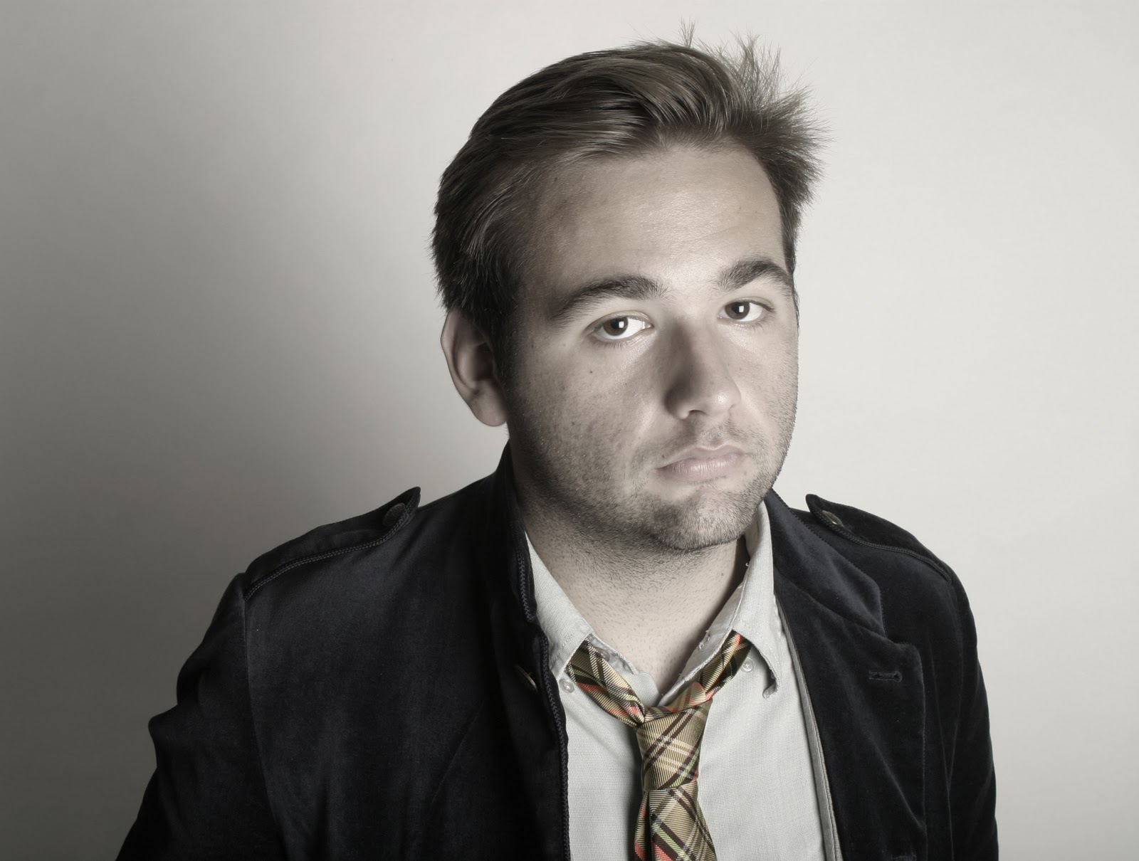
There is a lot of contrast with the lighting I used which brings out the emotional impact. Texture is very  important for my theme and it shows a lot. Also my model is not centered.
This photo contributes to the development of my theme by having a graffiti looking background. Even though the background is like random lines and hands of paint it, but it can still pass for graffiti. My idea did not change at all in the process of creating this image. My next photo I would like to take it in the grand theatre, on stage.

Thursday, November 18, 2010

Number 6.

 My composition is mainly focused on my model and the texture in the background. It brings a mutual feeling because of the light, dark and the straight facial expression.
This picture contributes to my theme because of the background texture again. My idea did not change. I just need more areas to shoot at and I also need help on placing and like modeling my model in way that will go with my theme.

Monday, November 15, 2010

Number 5. [re-do]

This photo was taken in class . In front of a cabinet.  This photo is interesting because they are looking at each and also their hands are at the same level, although it wouldve been more interesting if her hands were doing the same thing as the graffiti character's. The composition is very light. This image contributes to my theme because of the naked painted guy. I need to redo this image.

Friday, October 29, 2010

Number 4. [re-do]

This photo was taken under a bridge right across the street from Plaza Bonita. At first finding this specific place was kind of hard because we had to walk down these dirt trails and go through bushes, but we didnt have to do all that because we found a trail to go right where we needed to go. This picture is interesting because the main focus is the happy face. I had my model smile to match the smiley flower. "CA" is the basic background. The tones, colors, and lighting makes this photo have a cool/dramatic look.


Wednesday, October 20, 2010

Number 3.

I like this picture a lot. My model fits in with the painting because she also has a bald head. It expresses the light of dark effect of a emotional feeling. It also has a dramatic look/ feeling .

Friday, October 1, 2010

Number 2.

I dont think this photo worked. Its not as urban as i wouldve liked it to be. But at the same time its still a cool picture. Her outfit does kinda fit the painting thing.I was running out of graffiti options here at school. The background is a big board thing with splattered paint. The water puddle makes this picture also cool. This was actually shot on a ugly day, it was raining. To sum it up I do like this photo, I just dont think it fits with my theme too much.

Wednesday, September 29, 2010

1st Theme.


My main idea of this picture is showing a graffiti/urban style. when I shoot the next time I need to focus on the positioning on what to do with the models I use. I chose this model because like her face is similar to the graffiti on the door an her body matches up with the lines and stuff. It took a lot to get her in the right position. To add a little more attention I had the door cut through her neck and yes it was attentionally. If you notice her leg that is bent, is matching up with the shadow; they are both slanted like in a diagnol line. Whisch is cool and makes it interesting.